UI kits bundle the building blocks of a product interface into one reusable system: buttons, inputs,
cards, tables, navigation bars, charts, modals and complete screens. This section focuses on interface
packs for dashboards, mobile apps and web projects where you want a consistent design language from
day one.
You will find dark and light dashboard kits, trading and analytics layouts, SaaS marketing systems,
mobile app flows, admin panels and multi-purpose component libraries. Most items include variants for
desktop, tablet and mobile, with spacing, color and typography tokens already mapped out.
Typical downloads ship with design sources (Figma, Sketch, Adobe XD) and sometimes HTML/Bootstrap
implementations. Layer names, auto layout constraints and component instances are structured so you
can customize colours, corner radii and typography without breaking the system.
These UI kits are ideal for MVP dashboards, copy-trading platforms, HYIP control panels, analytics
tools, client portals and admin back offices. Instead of designing every screen from scratch, you
assemble flows from pre-built sections and keep everything visually coherent.
Before handing the kit to developers, lock in your brand colors, text styles and spacing scale, then
export a small design token document. That makes the handoff to CSS, Tailwind or component libraries
much smoother and avoids “close enough” implementations.
Combined with logo packs, icon sets and mockups from the rest of the Graphics section, these UI kits
help you deliver products that feel polished on day one.
Browse UI kits and interface packs for dashboards, mobile apps and web projects.
Spartan Gladiator Logo
UI kit / interface pack
spartan gladiator logo design ready for use of your new project
65.00 USDT
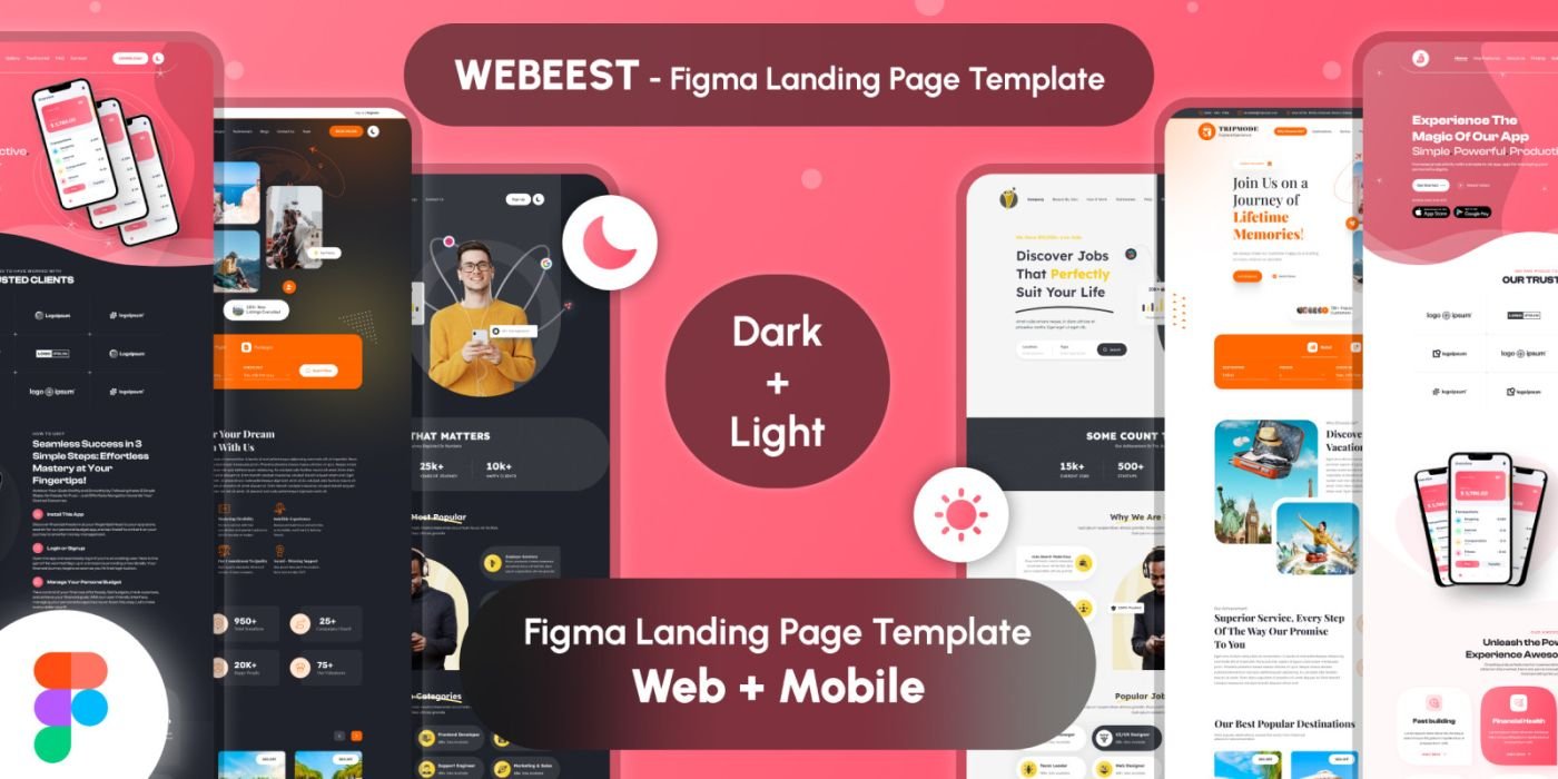
WEBBEST - Figma Landing Page Template
UI kit / interface pack
Multiple Landing Page Template is Unique and Modern Design
32.00 USDT
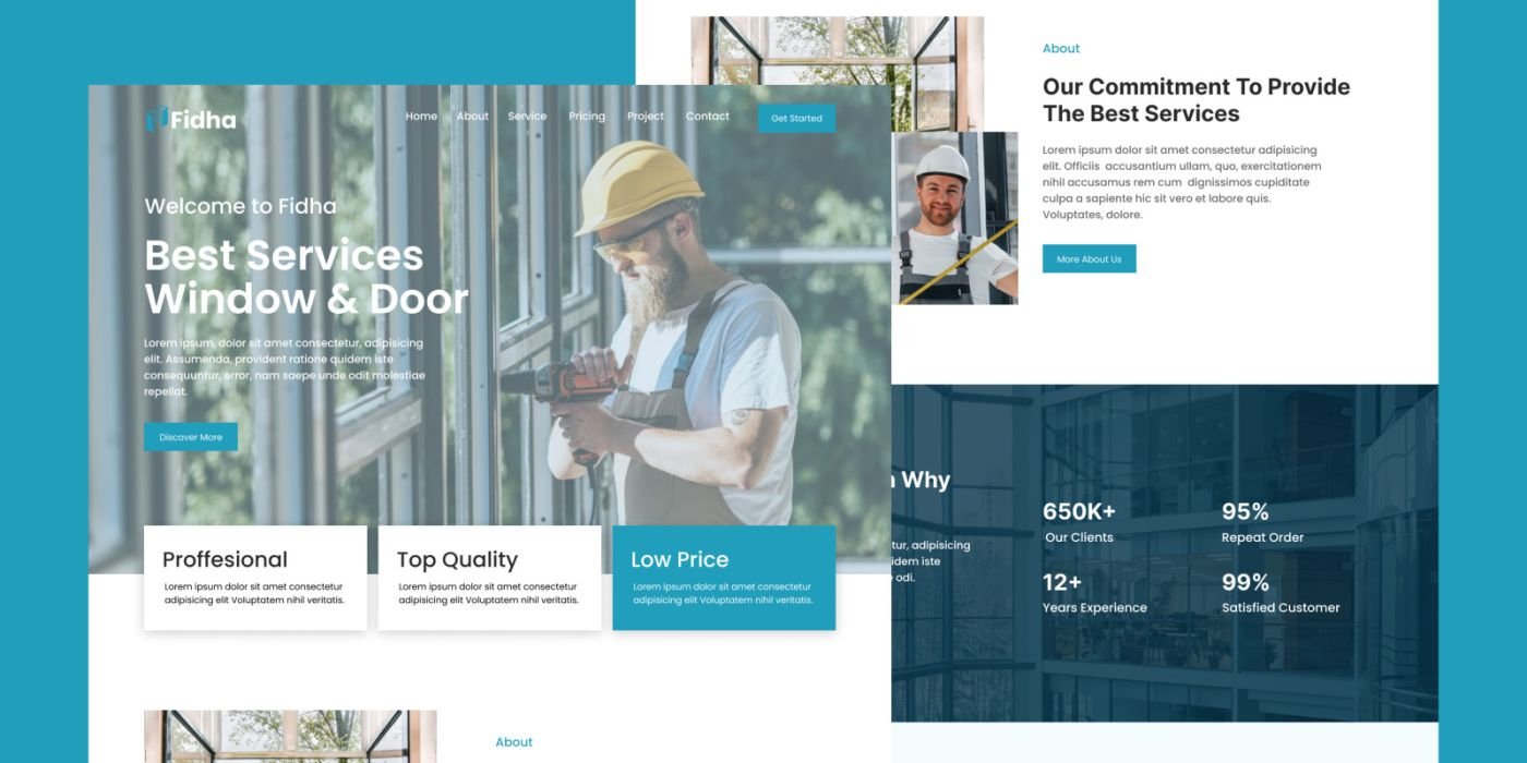
Fidha - Doors Windows Figma Landing Page Template
UI kit / interface pack
The Doors Windows Figma Landing Page Template is a meticulously designed digital solution tailored for busi...
20.00 USDT
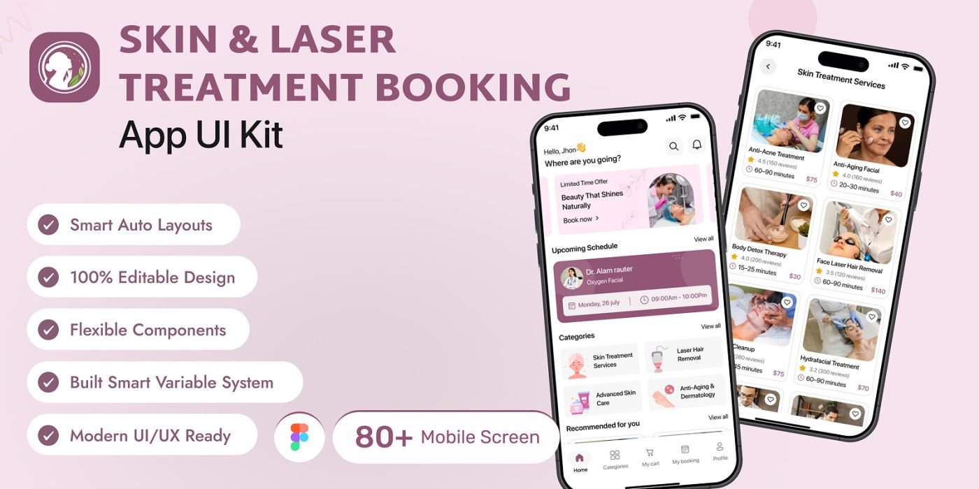
DermaGlow – Laser Treatment UI Kit
UI kit / interface pack
Overview DermaGlow is a premium Skin & Laser Treatment Booking App UI Kit, built in Figma to help you design m...
23.00 USDT
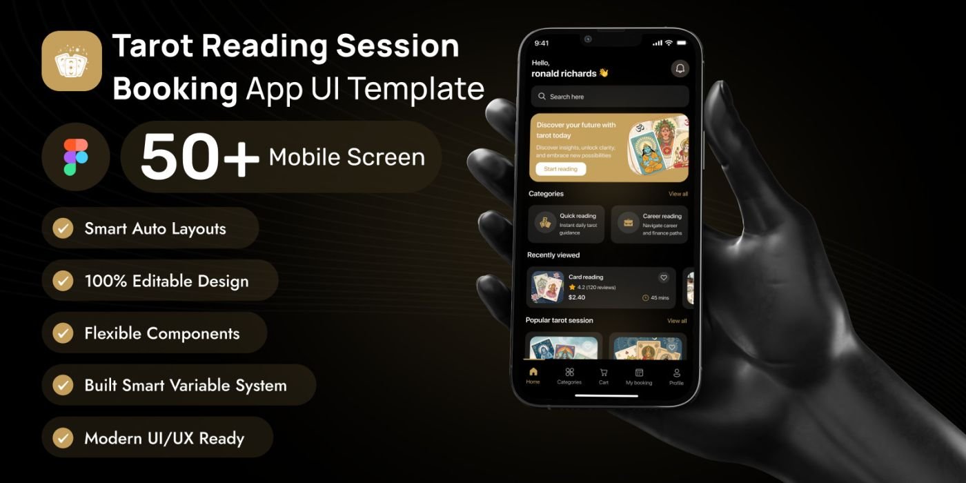
Tarot Reading Session Booking App Figma UI Kit
UI kit / interface pack
MystiRead is a premium Tarot Reading & Spiritual Consultation App UI Kit, built in Figma
23.00 USDT
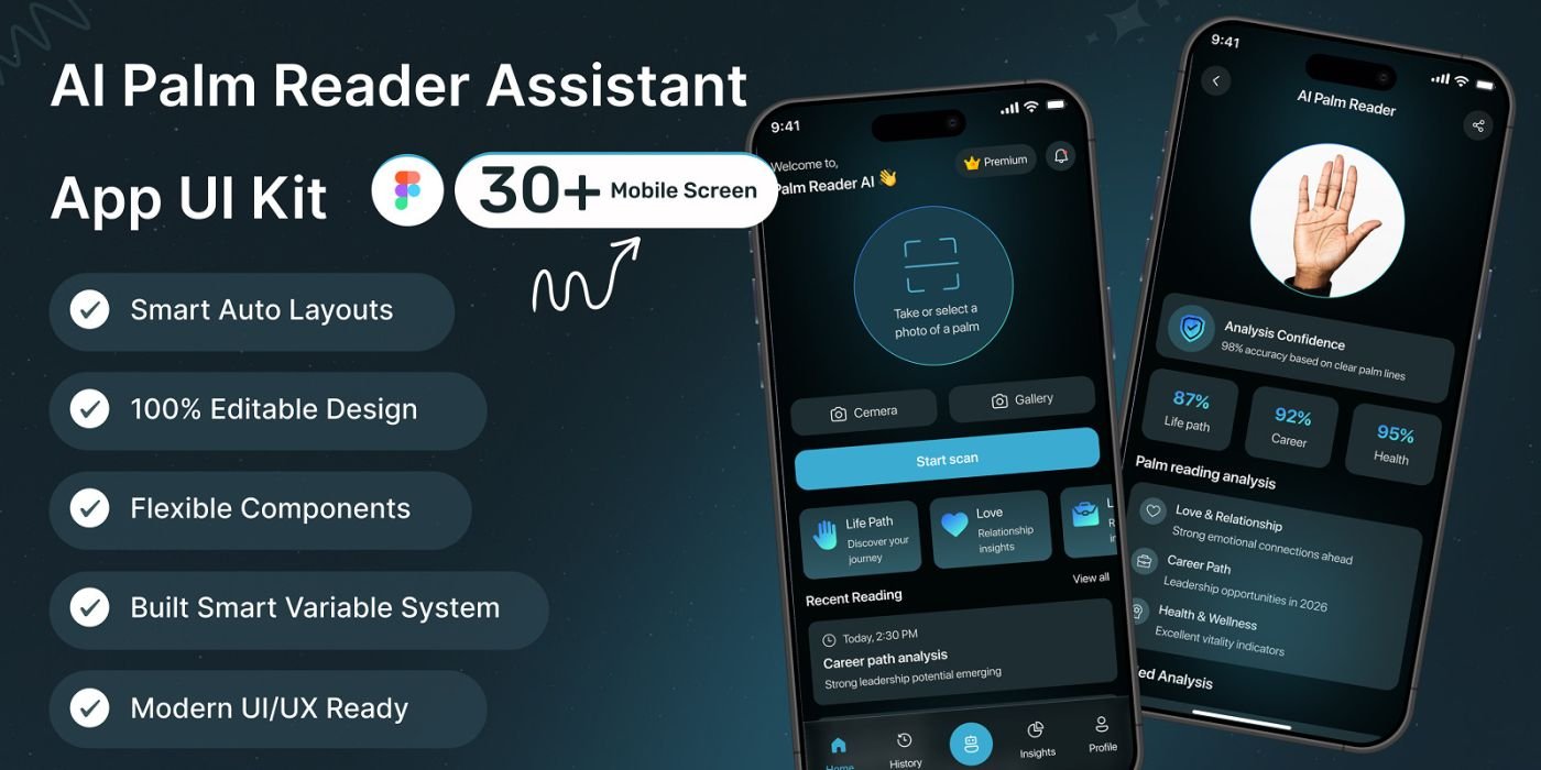
AI Palms – Palm Scanner App UI Kit for Figma
UI kit / interface pack
AI Palms is a modern Figma UI kit for AI-powered palm scanner or health analysis apps — 40+ screens, and cle...
22.00 USDT
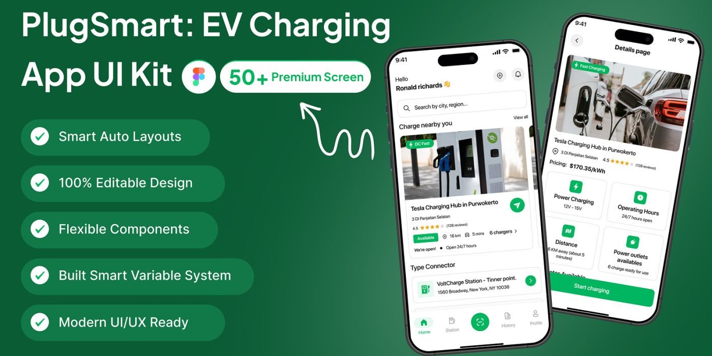
PlugSmart – EV Charging Finder App UI Kit
UI kit / interface pack
PlugSmart is a EV Charging Finder App UI Kit for Figma, featuring 50+ screens, light/dark mode
23.00 USDT
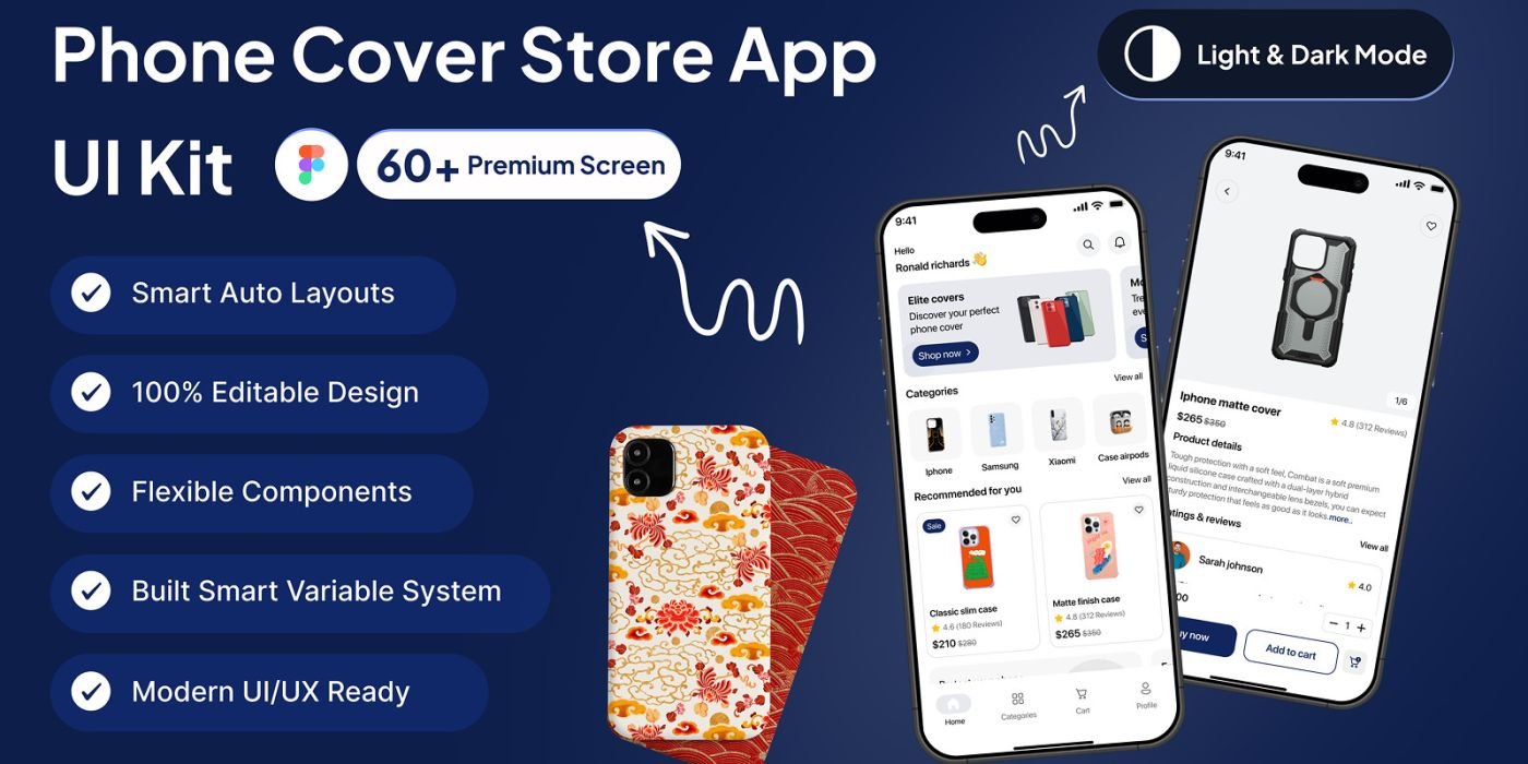
PhoneCoverX – Phone Cover Store App UI Kit
UI kit / interface pack
PhoneCoverX is a complete Figma UI Kit for mobile phone cover stores, featuring 70+ screens
19.00 USDT
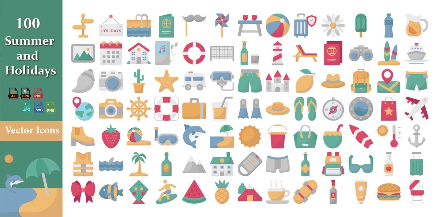
Summer And Holidays Icon Pack
UI kit / interface pack
Bright and cheerful summer icon pack featuring travel, beach, and holiday designs for creative projects.
14.00 USDT